
Icon design principles determine whether an interface feels obvious or confusing. Clarity matters more than consistency, especially once icons are used at scale in real products. If you design icons for apps, software, or brands, these decisions directly affect usability.
The myth of consistency in icon design
In design, consistency is often treated as the end goal. In many discussions around icon design principles, it is presented as a primary marker of quality, almost as if a design only becomes “good” once everything sits on the same icon grid, uses the same stroke weight, and follows a rigid, unified system.
In practice, consistency has become shorthand for quality, professionalism, and good design. That association is understandable. Consistency looks reliable. It signals control, calm, and order. At a glance, it reassures both designers and stakeholders that a system is under control.
When consistency hurts good icon design clarity
This is where things start to go wrong.
Consistency slowly shifts from being a means to becoming the goal itself, detached from the reason it was introduced in the first place. Design stops being evaluated on what it communicates and starts being evaluated on how well it confirms its own internal logic.
Design is not an aesthetic discipline. Design is visual communication. More precisely, it is the act of sending and receiving meaning.
Icons are small graphic elements used in interfaces to represent actions, features, or types of content. Each icon represents a single idea in simplified visual form. Like any design decision, icons exist to convey meaning, and someone on the other end has to understand that meaning for the design to work.
Good icon design creates icons people understand instantly, without effort. When that transfer fails, the design fails as well, regardless of how polished it looks or how consistent the system appears.
So the real question is not whether something is consistent. The real question is whether the message lands.
Studio note:
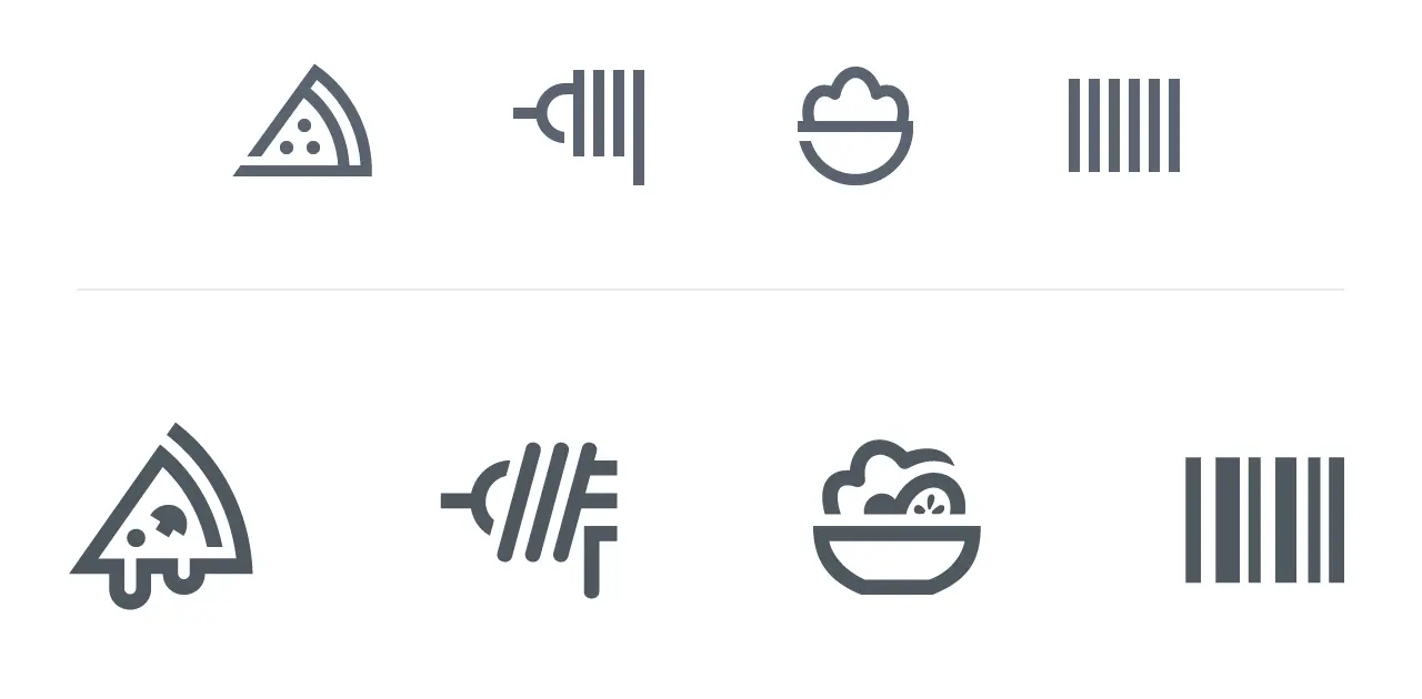
Top row plays safe. Perfect grid, perfect stroke, zero recognition. Openings seem a bit forced. The pizza reads as a diagram, or is it an clothes iron? The spaghetti fork is too abstract. The salad shape is too random; it could be any food. Barcode looks like a gate, maybe prison bars. Technically correct, cognitively slow. Bottom row breaks the system to save the idea. Melted cheese, organic cuts, solid details, uneven rhythm in the barcode. Wrong on the grid, right in the brain.
If the grid hurts the metaphor –> the grid is wrong.
Bottom row shows examples from the Gizmo icon set.
Once consistency becomes more important than clarity, design quietly shifts from communication to self-confirmation. The system may remain internally correct, but it no longer works for the user. That shift is dangerous precisely because it is hard to notice. Everything still looks right.
I have seen this happen repeatedly in practice. Systems that looked perfect during reviews still caused hesitation and misinterpretation once they were used in real interfaces.
Consistency as a tool in a strong icon system
Consistency is valuable. That is not up for debate. It supports recognition, builds trust, and creates rhythm and calm within an interface.
At the same time, consistency is not an absolute value. It is a tool, and like any tool, it only makes sense in relation to what it serves.
Consistency remains essential for coherence. It only loses priority when it interferes with understanding.
My position is simple. If you have to choose between a solution that is perfectly consistent and one that communicates more clearly, you choose clarity. Always.
A small inconsistency may irritate a few designers. Lack of clarity irritates everyone.
Why clarity matters in modern icon design and AI-generated icons
That tension will only become more relevant in the years ahead.
At a time when AI can effortlessly generate consistent designs, tight grids, flawless repetition, and endless variations within a single system, clear communication becomes a scarce resource. Comprehension. Meaning.
That is exactly why it is worth revisiting what the purpose of design actually is. Not to build systems that only make sense internally, but to create visual communication that is understood externally.
Consistency can support that goal. Understanding is the goal.
Icon design as visual communication
I was trained as a visual communicator. The core question was always the same: how do you convey meaning? Not how something looks, but what it does for the person on the other end.
Early on, that focus was primarily on brand identities and logos. Over time, it shifted toward icons and systems.
The same symbol that works in a communication context can fail completely as a system icon.
Not because icons are fun, but because they represent an extremely condensed form of communication. Very little space. A lot of meaning. No room for explanation.
That shift permanently changed how I think about design.
Design is not decoration
Icon design is still often treated as something you add later, a layer on top meant to make an interface look nicer or more polished.
In practice, it works the other way around.
Design is the message, or more precisely, it is the vehicle through which the message is delivered. An icon, a shape, or a visual system has no value on its own. It only gains meaning once someone understands it. Without that understanding, what remains may be refined or technically correct, but it is empty in terms of content.
Sending and receiving
Every design decision is a form of sending. You put a signal into the world, consciously or not. On the other side, someone has to receive that signal and interpret it.
This is where things often break down. Not because the design is bad, but because the conversation becomes one-sided. You see it in design reviews, handovers, and systems that are internally flawless yet raise questions externally. A lot of sending happens, but very little attention is paid to how things are received.
I have often seen designs that are perfectly coherent within the maker’s system, yet carry very little meaning for the user. From a technical standpoint, the work is solid. From a communicative standpoint, nothing lands.
When icons are unclear, the user experience suffers immediately, even if the design system looks perfect.
When icon design fails for users at different icon sizes
If the receiver does not understand what is being communicated, the design fails.
Effective icons reduce user errors by relying on shape, structure, and familiar symbols that make their purpose immediately understandable. When that understanding is missing, it does not matter how clean the construction is, how consistent the set looks, or how much care went into the details.
That understanding is always tied to size.
An icon that works at 32px can fail completely at smaller sizes. Details collapse, contrast shifts, and visual balance changes. At smaller sizes, optical weight shifts faster than most systems anticipate. Icon sizes are not a technical afterthought. They directly influence whether meaning survives once an icon is placed inside a real interface.
Studio note:
Top row treats every shape the same. Same size, same stroke, same proportions. But something’s off. The arrow looks too big, yet somehow also too thin. It needs optical correction. The system says it’s correct, but you feel the imbalance.
The rows below let go of the rules. Arrow smaller first, still not right. Feels weaker. More stroke gives more weight and better balance with the set. Mathematically incorrect, but it finally feels right. Less friction.
Equal size does not mean equal optical weight. If two icons feel different, they are different. Adjust them.
Examples shown are from the Wired icon set.
This difference in optical weight is one of the most overlooked factors in icon design. At small sizes, stroke thickness stops being a stylistic choice and becomes a readability problem. A grid guarantees alignment, not recognition, which is why understanding is not a bonus but the baseline.
Stepping away from designer-centric thinking requires a certain ego-lessness. It means letting go of what feels logical to you and focusing instead on what works for someone else. Not designing to demonstrate how clever the system is, but designing to make sure it is understood.
That is not a dilution of the craft; it is exactly where the craft begins.
Design is not defined by how it looks to the maker. It is defined by what it enables for the receiver.
The role of consistency in icon design
Consistency serves a purpose. It brings calm to a design, creates rhythm, and makes things predictable and therefore more trustworthy. For users, that means less noise, less doubt, and less cognitive effort. You do not have to reinterpret everything you see, because previous encounters help you understand new signals.
That effect is real, and it matters. That is why many designers instinctively rely on consistency when building icon sets and visual systems.
When building icons in Adobe Illustrator, you can keep everything mathematically consistent and still end up with symbols people hesitate about.
Why consistency is not a fixed rule in icon systems
At the same time, consistency is not a law of nature. It does not exist independently of context.
What brings calm in one system can create friction in another. Consistency is always relative to the audience, the application, and the mental models users already carry with them.
Take the car emoji. It often faces left, a choice that traces back to its Japanese origins and vertical reading patterns where directionality differs from Western norms. In that context, a car moving forward can logically point left.
In a Western left-to-right reading culture, the same icon can feel off, almost as if the car is going backwards. I still notice that friction myself every time. The icon is consistent within its original convention, but in a different reading context, it feels slightly wrong.
The same visual solution works clearly in one situation and less so in another. In cases like this, consistency itself is not the problem. The assumption that it is sufficient on its own is.
Consistency as a communicative choice
That is why consistency should not be treated as an absolute value, but as a communicative choice. A tool you use to make something easier to understand, nothing more and nothing less.
The moment consistency detaches from communication, friction appears. A system may remain internally correct, but externally, it starts to resist. For the user, it no longer feels logical, even when it is technically flawless.
Strong icon systems do not start with the question “Is this consistent?” They start with “What does someone need to understand, recognize, or do?” Only after that question is answered does it make sense to ask how a coherent system can support that goal.
Consistency is not a goal in itself. It is a tool you apply deliberately or deliberately set aside. That is where design work moves beyond maintaining a system and starts serving communication.
How users define clarity in UI icons
Clarity is not a fixed property. It does not exist independently of context. It always emerges in relation to the person who is looking.
Metaphors are culturally shaped. What feels obvious in one context can miss the mark entirely in another. That applies to icons just as much as to shapes, symbols, and visual shortcuts.
Clarity is not a built-in quality of a design. It is the result of a match between what you show and what someone already knows.
What influences user experience in icon design
In practice, understanding is shaped by many factors. Age plays a role. Education does too. So do digital literacy and familiarity with interfaces.
Someone who works with software every day recognizes patterns and conventions quickly. For that person, many things feel intuitive. For someone without that frame of reference, the same design can suddenly feel unclear or even confusing.
That gap is often underestimated.
Real world example: the magnifying glass icon
Consider the magnifying glass icon in police contexts. There it is strongly associated with investigation and detective work. For people inside that world, the meaning is obvious. The icon does not mean search, it means investigation.
For many citizens, the association is different, even with so-called universal icons. They read a magnifying glass as search, inspect, or zoom. The shape is the same, but the meaning shifts.
The icon is consistent. The interpretation is not.
When clarity comes from use rather than appearance
Not every icon needs to explain itself in isolation. In many interfaces clarity comes from recognition over time rather than instant interpretation.
What matters first is distinction. An icon must be visually different from its neighbors so users can locate it reliably. Meaning then stabilizes through repetition. People stop asking what it depicts and start remembering what it does.
In those situations learnability matters more than out-of-context recognizability. The goal is not that someone guesses correctly once, but that they understand instantly and never hesitate again.
Designer logic versus user experience
What feels self-evident to a designer often is not to a user. That is not a value judgment, but a natural result of different perspectives.
Designers live inside systems. Users do not. They simply want to understand, find, or do something without having to understand the system first.
A strong icon works because people recognize it immediately. Nobody studies a play button. People just press it. That is where things go wrong when design is tuned primarily for peers. Everything may make sense within the discipline, but not necessarily outside it.
Designing for peers is not the same as designing for users.
Thinking in personas for better icon design
To bridge that gap, it helps to be explicit about who you are designing for. Not as a marketing exercise, but as a thinking tool.
Personas force you to step outside your own frame of reference and clarify assumptions about knowledge, experience, and context. Understanding does not come from trying harder. It comes from aligning better, otherwise designs start to break down.
That is where testing for clarity really begins, not based on taste or opinion, but on recognition and understanding.
Consistency versus clarity in icon systems
In almost every design process, the same moment appears. Two solutions are on the table. One fits the system perfectly. Everything aligns. The rules are followed. The consistency is flawless. The other deviates slightly. A rule is bent, but the message is clearer, more direct, and less ambiguous.
That is the moment when design decisions start to matter.
Consistency feels safe, especially for the maker. It provides structure and confirms that the system holds. But safety for the maker is not the same as clarity for the user.
A solution that is slightly less consistent can still function perfectly well. A few designers may notice, but for most users nothing happens. They understand what is meant and move on.
Unclarity works differently. It affects everyone. Anyone who has to pause, hesitate, or reinterpret what they see.
A well designed icon is not the most consistent one, but the one that is understood without hesitation.
The impact of inconsistency and unclarity is not symmetrical. A small inconsistency may irritate people who see the system behind the design. Unclarity creates friction for everyone.
I see that difference in almost every project, and it is often underestimated.
This is not an argument against consistency, nor a license to abandon rules. It is about priority. When a choice has to be made, clarity outweighs consistency because communication comes first.
A design that deviates slightly but is understood still does its job. A design that is perfectly consistent but not understood does not, because in real products icons live next to text, motion, density and time pressure. That is where clarity proves itself.
Uniformity reassures makers. Being understood serves users. That tension sits at the heart of this entire article and of many design problems where systems and communication intersect. When that moment is reached, a choice has to be made, and that choice reveals what the design is actually for.
Ultimately, icon design exists to improve user experience, not to satisfy a system. That is what defines a high-quality icon family over time.
