
Icons are often discussed as a visual problem, framed around style, consistency, and aesthetics.
That framing misses the point.
The difference between system icons and communication icons is rarely discussed explicitly, yet it defines how icon libraries should be structured. Understanding system vs communication icons is essential when designing a scalable icon library. These two icon types solve fundamentally different problems, and treating them as the same type is one of the main reasons icon libraries slowly lose clarity.
In real interfaces, icons carry operational weight. They replace text, guide actions, and reduce decision time, which is why they are scanned rather than admired.
System icons operate the interface. Communication icons convey meaning. They may share visual DNA, but they are not interchangeable.
Studio note:
Most icons here are system icons. Simple shapes for quick actions: security, warning, camera, alert. The drone icon belongs to the same icon family, but behaves differently. It describes a specific object and carries more detail.
In a control bar that extra detail becomes noise. The icon starts to read like an illustration instead of an interface symbol.
System icons operate the interface. Communication icons explain context.
Icons created for the Dutch Police.
Size determines icon function
Icon size is not a cosmetic choice, but a hard constraint.
This becomes especially visible when comparing system icons and communication icons, because size determines which role an icon can realistically perform.
In practice, icons at 32 px and below function as system icons, because recognition and speed matter more than expression at that scale. As size decreases, design freedom collapses rapidly, with every pixel carrying semantic and optical weight.
At 16 px, the constraints become extreme. Many shapes no longer survive, counters disappear, and contrast becomes unreliable, which sharply limits the concepts that can be represented.
This is why not every idea can be turned into a UI icon, and why system icon design is less about creativity and more about restraint. This distinction becomes obvious once icons are pushed into their smallest real-world sizes.
What defines system icons
A system icon is built for small sizes and repeated use inside interfaces. They rely on familiar, universally understood symbols, not because designers lack imagination, but because recognition must be immediate.
Conceptual meaning is intentionally limited. System icons represent actions, objects, or states users already understand, allowing interaction to remain fast and predictable.
Style is reduced on purpose to keep the icon simple. Decorative detail, texture, and expressive features are removed to protect clarity and legibility.
System icons rarely function on their own. They exist within a larger UI context, supported by labels, layout, and interaction patterns.
Their job is not to explain, but to work.
Why small system icons must be simpler
Style does not fail first. Recognition does.
As icons shrink, detail collapses faster than expected. Shapes merge, visual noise increases, and metaphors lose definition.
At small sizes, the number of usable shapes drops sharply, limiting how abstract or conceptual a system icon can be. Fewer viable shapes means fewer viable metaphors.
This is not a design opinion. It is a physical limitation, and good system icon work accepts it early rather than fighting it later.
What defines communication icons
Communication icons are designed to work at larger sizes, with use extending beyond core interface controls.
They are not bound to the same spatial pressure as system icons, which allows for more detail, character, and emphasis.
Their primary role is explanatory rather than operational.
Helping users understand ideas, features, or states is the goal.
Meaning comes first, interaction second.
Tone and personality can be embedded without breaking usability, allowing brand identity, mood, and narrative to surface when context permits.
Communication icons in interfaces and system layers
In practice, communication icons appear across multiple interface layers.
They are commonly found in status bars, notification centers, and communication-heavy interfaces, where they indicate messages, calls, or status updates.
Dynamic behavior is common in these contexts.
Badges, color changes, and state variations help signal attention, urgency, or activity without relying on text alone.
Here, communication icons support awareness rather than direct action.
Communication icons in content and brand contexts
Outside of core UI, communication icons function as signposts for content.
They help break up dense information, support users with cognitive or language barriers, and guide scanning across pages, screens, or printed materials.
In marketing, infographics, and brand communication, these icons contribute to recognition and tone.
They can be adapted to different styles while preserving a clear informational role.
This flexibility allows communication icons to align with a brand’s visual language without sacrificing clarity.
When icons are distributed as files rather than embedded in a product, attribution requirements may also apply.
Why icon libraries need both icon types
The distinction between system icons and communication icons exists because they solve different problems.
System icons cannot replace communication icons, because they are too constrained to explain complex ideas clearly. Communication icons cannot replace system icons either, because when forced into tight UI roles they lose clarity and slow interaction.
An icon library that ignores this distinction will always compromise somewhere. Either usability suffers, or communication becomes flat and generic.
Over time, these compromises tend to accumulate rather than cancel each other out. A library that supports both roles avoids that trade-off.
System vs communication icons aren’t style
The difference is functional, not aesthetic.
Visual consistency does not equal functional consistency. Matching stroke width or corner radius does not resolve role confusion.
Mixing roles causes more damage than mixing styles. An expressive icon placed in a critical UI control is a bigger problem than a minor visual variation elsewhere.
Clarity comes from respecting purpose, not enforcing uniformity.
Analogy: display fonts vs body text fonts
The distinction between system icons and communication icons mirrors typography.
Communication icons behave like display fonts, carrying character and attracting attention. System icons behave like body text fonts, prioritizing legibility under repetition and density.
No serious type system relies on a single font for everything, and icon systems should not either.
In both cases, size dictates function.
From communication icons to system icons
System icons are often reduced versions of communication icons.
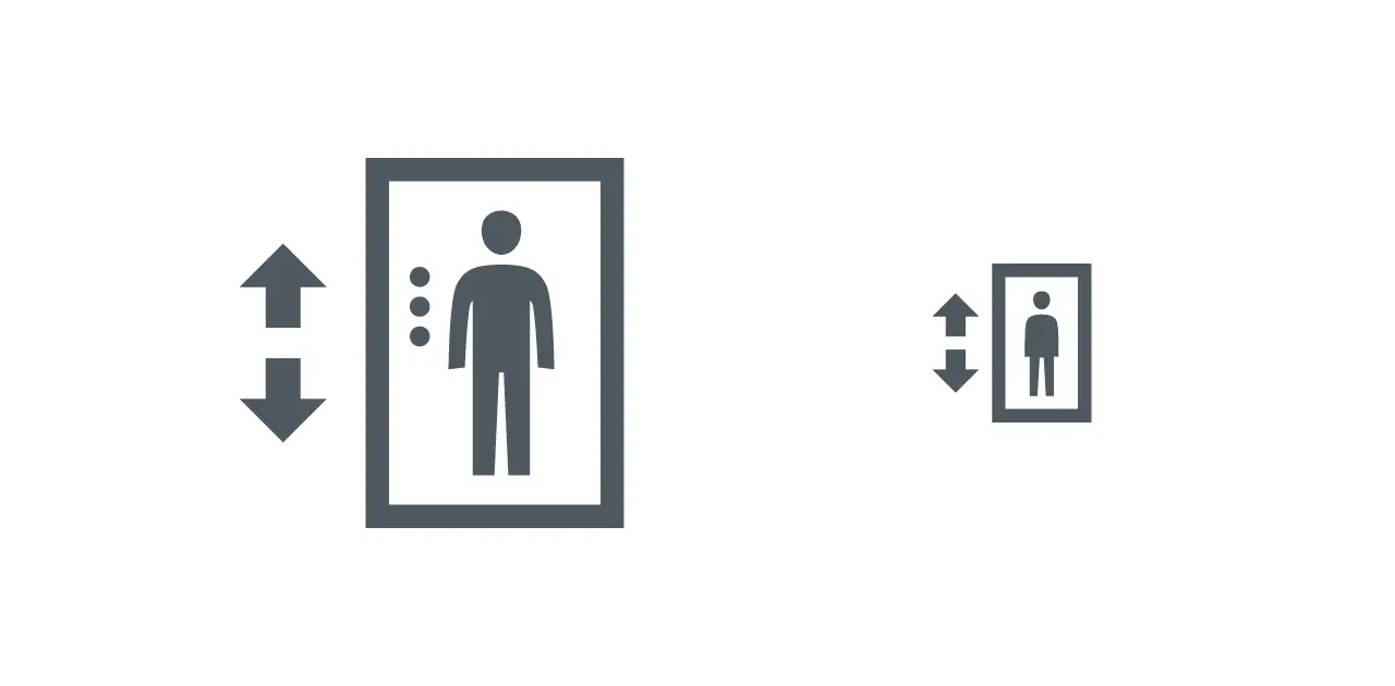
Studio note:
The detailed version reads clearly as an elevator. Doors, panel, human figure. Good as a communication icon.
For system use the icon is simplified. The structure stays the same, but unnecessary detail is removed.
Only the essential parts remain: the cabin and the vertical movement.
Same subject, reduced for system use.
Icons created for the Dutch Police.
This reduction is a design process, not a visual downgrade. Character is stripped away without losing meaning.
Simplification improves usability when it is deliberate, even though not every expressive feature survives the transition.
The goal is not visual sameness, but functional continuity across sizes and contexts.
System vs communication icons in interfaces
System icons are optimized for 16, 24, and 32 px UI contexts, including navigation arrows, arrow indicators, close buttons, search loupes, and file actions.
Communication icons appear in onboarding flows, empty states, explanations, and brand messaging, where they support understanding rather than interaction.
Strong icon libraries separate these roles clearly while maintaining visual alignment, creating coherence without forcing everything into the same mold.
Designing a coherent icon library
Coherent libraries explicitly separate icon roles and size ranges. This separation defines the icon library structure.
Alignment is maintained through proportion, construction logic, and rhythm, not through flattening all differences.
Clarity at the library level prevents long-term decay. When roles are clear, extensions remain consistent without becoming rigid.
Choosing the right icon type
System icons are the correct choice when speed, clarity, and repetition matter. Communication icons make more sense when explanation, emphasis, or tone is required.
Many interface problems are not layout or style issues, but icon role mismatches.
Putting an expressive chat bubble illustration in a toolbar slows recognition, while a simple outline works instantly. Once roles are respected, most icon decisions start to make sense.
Accessibility and performance considerations
System icons naturally perform better at small sizes, as reduced forms make contrast, legibility, and touch clarity easier to maintain.
Accessibility guidelines such as WCAG emphasize sufficient contrast and clear interactive targets, which simple, high-contrast system icons tend to support by default.
Communication icons allow more detail and variation, but require more care. At small sizes, increased complexity raises the risk of reduced legibility and visual overload.
Separating icon roles supports accessibility from the start, instead of turning WCAG compliance into something that needs fixing later.
Icon libraries fail when roles are blurred
Icon libraries rarely fail because of style.
They fail because roles are blurred.
When system icons and communication icons are treated as interchangeable, clarity erodes over time.
Understanding system icons vs communication icons is not a constraint.
It is what allows an icon library to scale without losing clarity.
Once roles are clear, most icon decisions stop being subjective.
